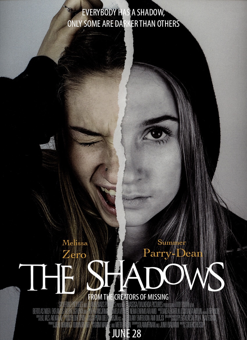
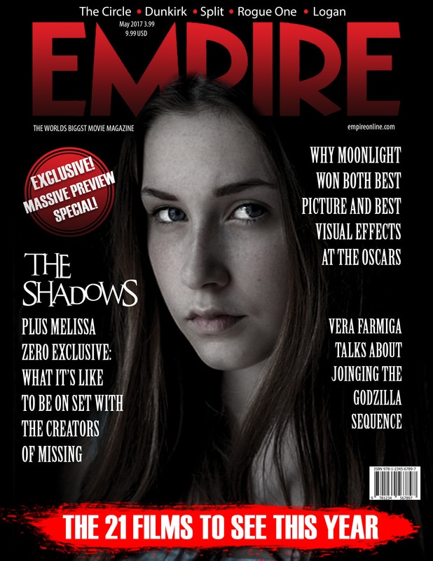
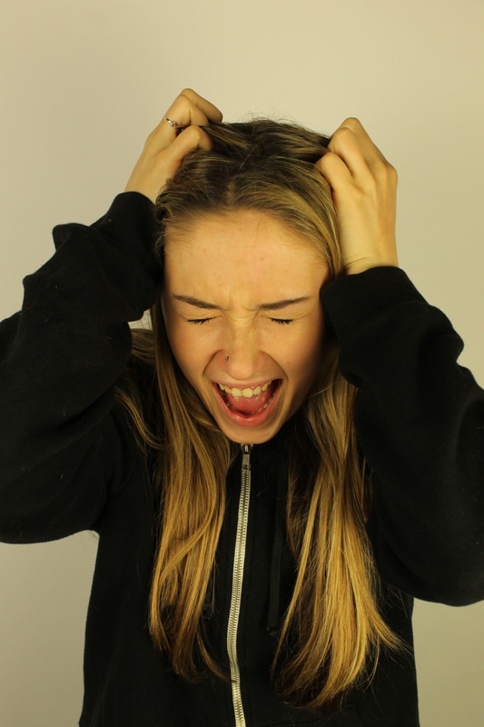
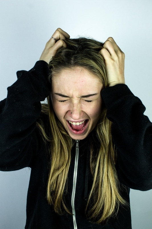
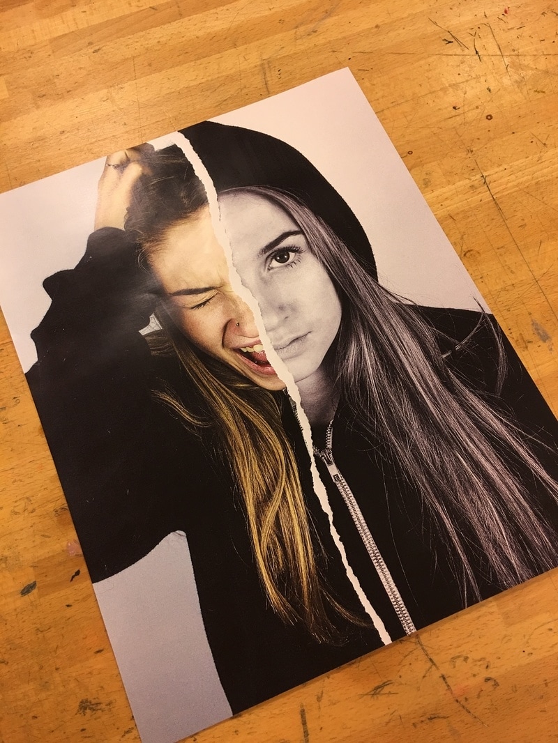
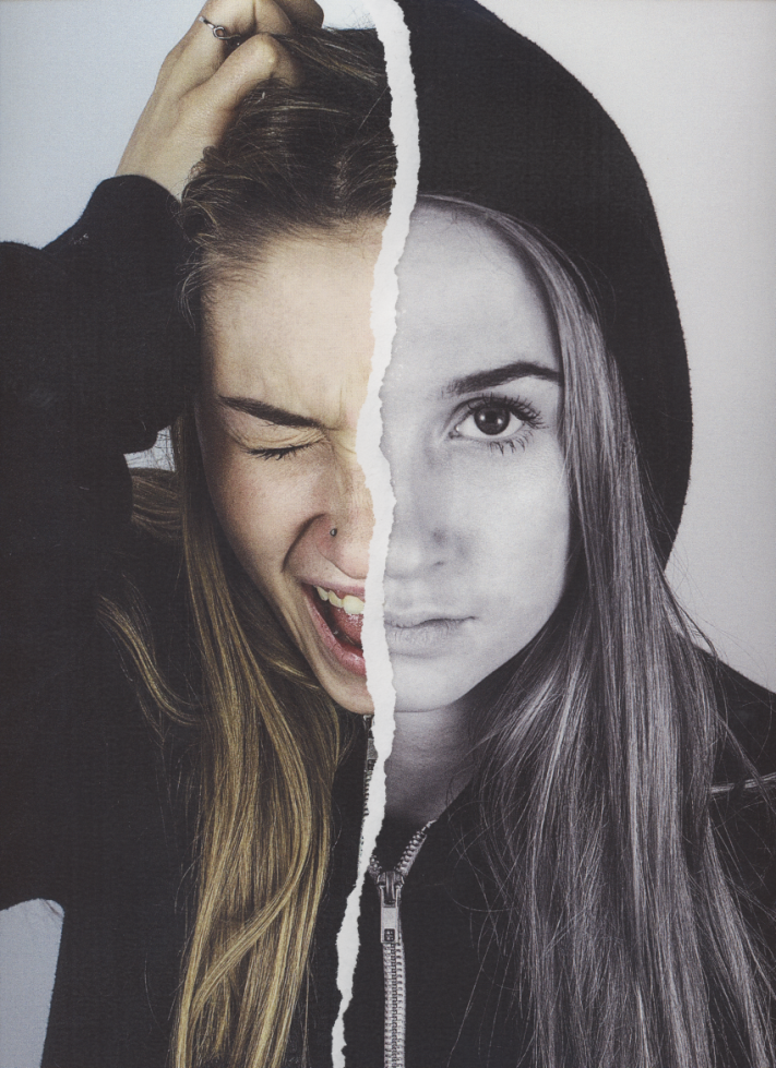
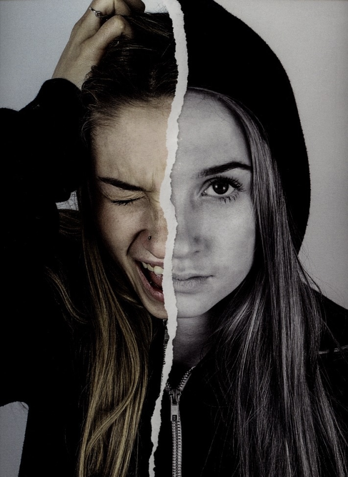
 Lightroom ExperimentsFor my poster I used the photo studio in the Photography department at school and I used a plain white background to take pictures of our films main Actress, Milly Zero. I decided to use the plain white background because most film posters that I had looked have a main subject (this is usually the actor/actress) with a plain background so that the focus is on that main subject. To take my photographs I used a Canon 1100D camera and used continuous lights. I decided to use continuous lights rather than a flash because I felt that if I had used flash the images would come out too editorial and fashion-like. I also made Milly pose in positions where she was screaming or I made her stare at the camera with a mysterious expression on her face. I made these choices because I wanted my poster to show Chelsea's significant characteristics. 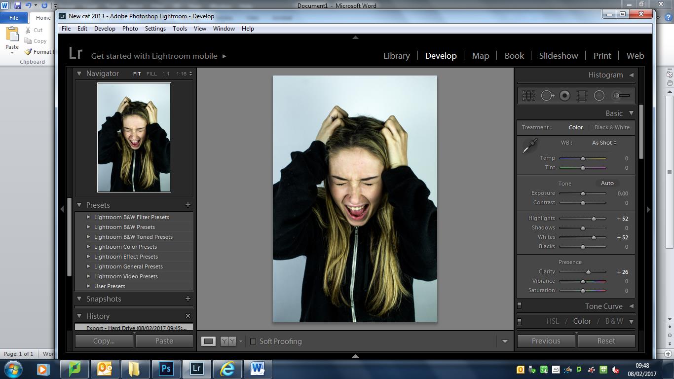 Once I had taken my images I then took them into Lightroom where I would render them. When I looked at my images before I had done this they all had very yellow undertones and I didn't want this for my poster. In Lightroom I changed the temperature of the photo, the tint, exposure, whites, blacks, shadows and highlights until I felt that I was happy with what the image looked like. I changed one of my images to black and white. This was to show a 'dark side' of Chelsea's character. My idea behind my poster was to show the 'two sides' to Chelsea's character in our film.
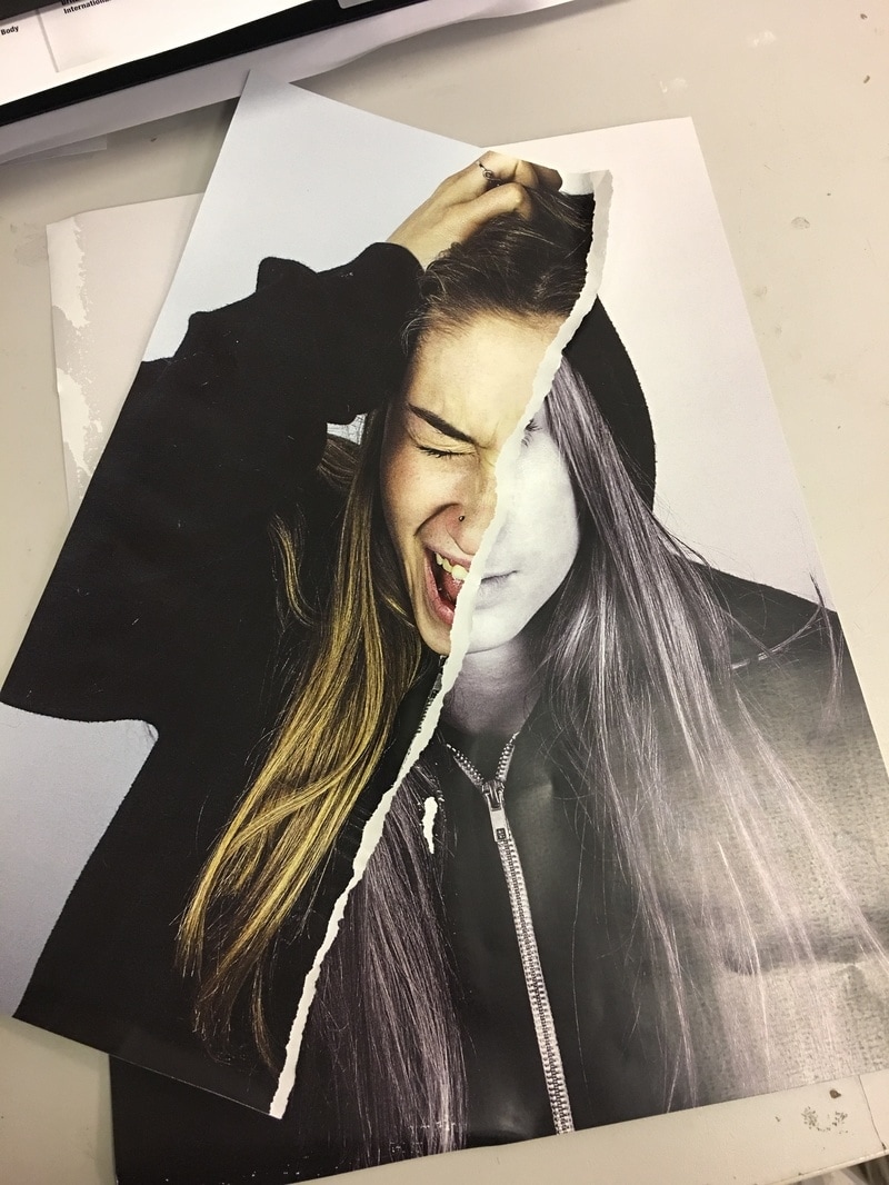
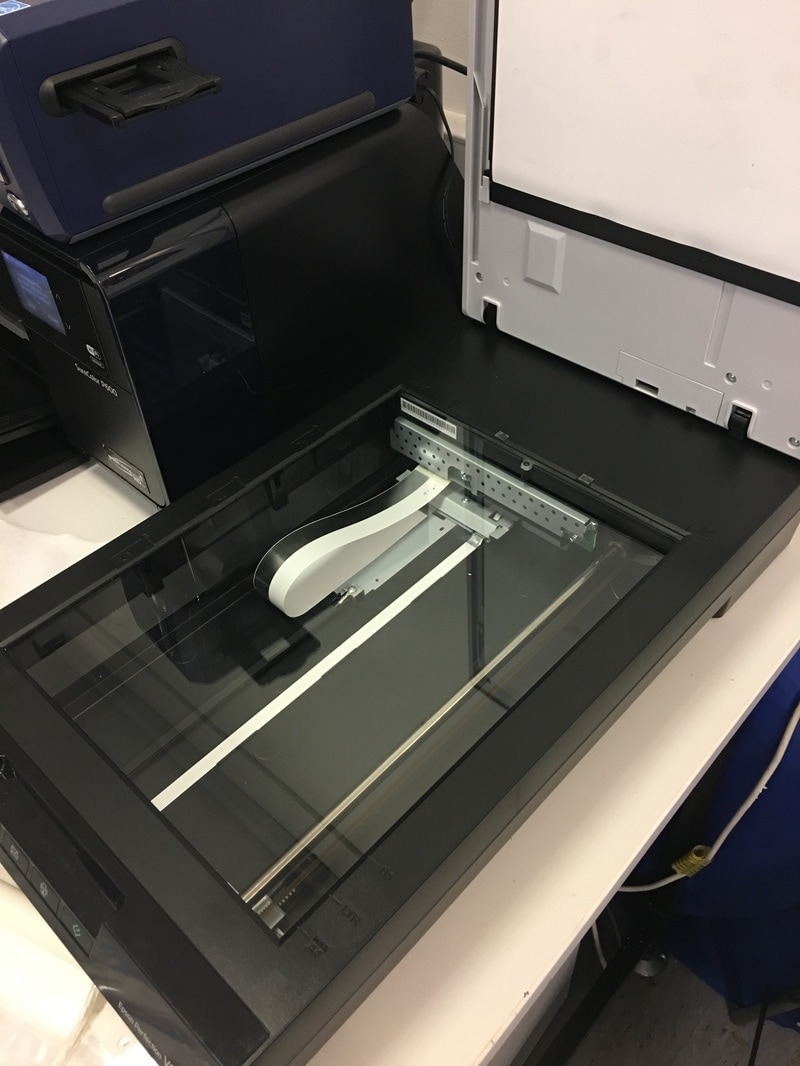
After I had edited the two images I wanted to use I then printed them in A3 on glossy paper. I then took one of the images, and I ripped in in half, in the middle, so that I could then stick this half, onto the other image in order to make a whole new image. I then used a scanner to scan this image, in Photoshop. Although the potential viewers of the film haven't watched it yet, after they do they will realise that the poster shows two sides of Chelsea for a reason. Photoshop Experiments
After I had scanned my image, the photo appeared quite faded on my computer screen, as the scanner doesn't pick up all of the detail in a photo. Therefore I had to go back into Lightroom to render the new image so that it had a higher contrast and appeared a lot more clear and saturated. I also used the Spot Healing Brush Tool in Photoshop so that I could get rid of any blemishes and imperfections so that Milly's face looked airbrushed - like most people on magazine covers. I decided to look back at my previous task on poster analysis to help me come up with ideas for my own poster, I also used the internet to find further secondary research on more film posters so I knew exactly what it was that I wanted/needed on my poster I order for it to look affective. For the title of the film - The Shadows - I went on dafont.com to find a font which I felt suited my poster the most. I found the font I used on the list of 'distorted' fonts because I felt that distortion was the type of style that I was looking for because it fits well with the thriller theme. I print screened this page on the internet and I opened the print screen up in Photoshop where I used the Magic Wand tool to select the letters only, so that I could paste them onto my poster cover. 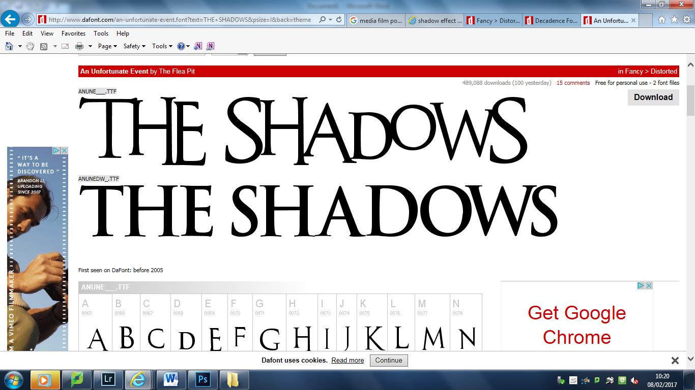 After I had done this I looked back on my poster analysis post so that I could refresh my memory on the conventions of a film poster. I then added a one-liner, the release date, the name of the main actresses, the credits and 'From the creators of Missing'. I added a one-liner (Everybody has a shadow, only some are darker than others) so that the audience can get an idea of what the film will be about. The release date was added so that the audience could know when the film was going to be in cinemas. I thought it was necessary to add the names of the actresses so that the fans of those could know that they were staring in the film - this may attract more potential viewers. 'From the creators of Missing' allows the audience to know that we have also created another film - this is a form of synergy, as its advertising not only 'The Shadows', but also 'Missing'. 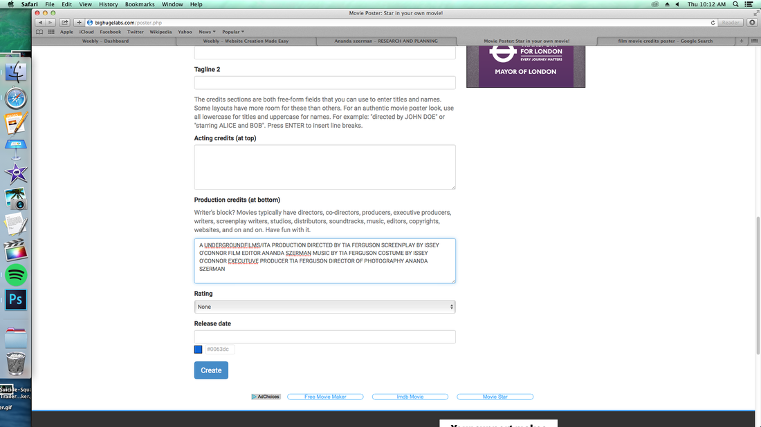 For the credits I used a website called bighugelabs.com. Here I could insert all of the writing that I needed to include and it generated credits for me. I added this to my poster in Photoshop.
|
AuthorWrite something about yourself. No need to be fancy, just an overview. ArchivesCategories |
 RSS Feed
